

Interface update

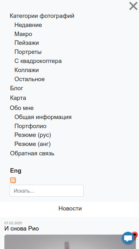
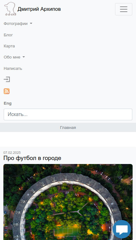
Nav menu on my site initially was fully custom. In some aspects, it suited me perfectly, but over time, as the number of items increased, I ran into limitations with its mobile version when displaying dropdown lists. The lists were always expanded, which was not acceptable to me. A few days ago I decided to completely rewrite menu with Bootstrap. While its appearance on mobile screens still raises some questions for me but it’s better than before.
It used to look like this on desktop:

Now:

It is done:
- - Add search form directly to the top menu
- - Free up space on the page by removing headers and replaced them with "breadcrumbs"
- - The menu item whose page is open (or its submenu) becomes darker compared to the others
- - Add "Portfolio" section
- - Implement pagination
- - Slightly change the formatting on the news page
- - And made a lot of changes "under the hood"
Now:
Back